2K Games
US publisher of computer games, owned by Take-Two Interactive.
2K Games was formed in 2005 in partnership with Rockstar Games and Global Star.
2K Games uses a personalisable CMS platform where they can manage components for new game websites. I worked on the development of these components, as well as the creation of a platform for game testers where both players and administrators could manage the playtests.
role
Product Designer
market
Ireland / USA
Participation
6 months
industry
Gaming
scope of work
UX Design
UI Design
Components
Audit
Insights gathering
System scalability
tools
Figma
Miro
Slack
Confluence
Jira
Zoom
Contentful
Okta
Process
My first task on joining the team was to clean up the files and documentation. There had been many designers working on the project before me and somewhere along the way the uniformity of the system had become blurred. There were a lot of undescribed files, things like icons or colours were taken from several different design systems, so the screens were sometimes different.
The team was split into two sub-groups - one working on the CMS, the other on the game testing platform. As I was the only designer on the team, I combined the two groups and covered tasks from both areas.
This involved working with different developer groups, but also with different stakeholder groups. Each project was the responsibility of a different group of people on the client side.
Before each new project, discussions were held with the client about their expectations and guidelines. The guidelines, unfortunately, changed quite often during or after the project, making it necessary to be flexible and focused on the client's best interest. At the same time, I was able to defend my decisions
and look after for the user's needs.

Beacon components
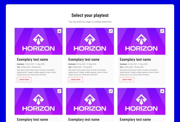
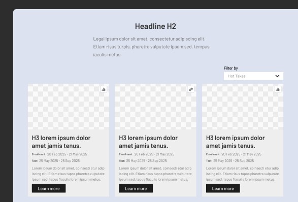
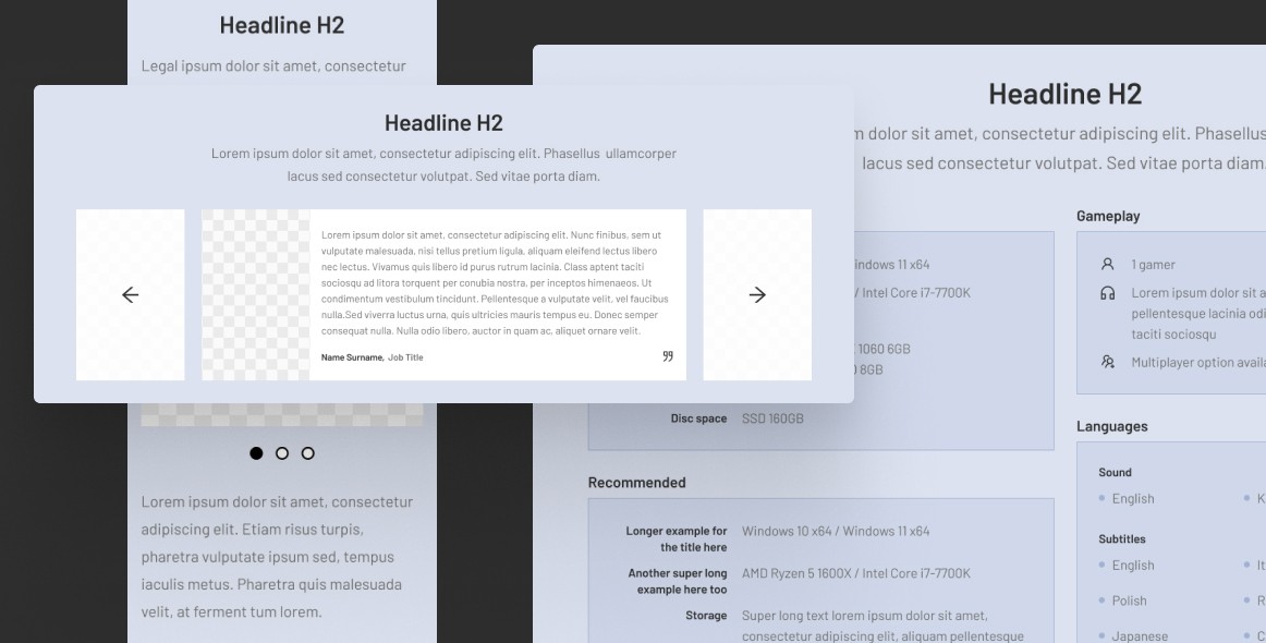
Because 2K uses its own CMS to manage a number of game titles, it was necessary to create components that could
be reused in different situations and for different sites. Moving the main 2k.com site to the CMS was also a big challenge. Over the course of several months, the team and I created dozens
of large components with this migration in mind. These were then styled and populated with content on the site.
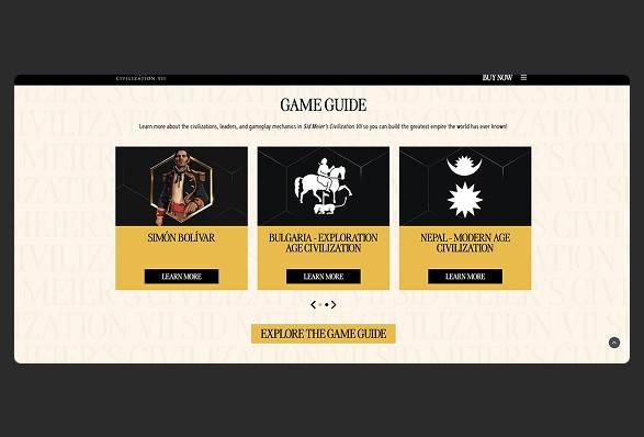
These components had to be generic so that once styled, they would fit both the game site and the main company site. At the same time, they had to be interesting enough to attract the user's attention and help the site look modern.

My overall role here
analysing competitors and market trends to identify opportunities and challenges,
collaborating with franchise teams,
working closely with product managers, stakeholders, and other team members to align design with business goals,
collaborating with engineers to ensure feasibility and smooth handoff,
presenting design concepts and rationale
to stakeholders,
acting as a bridge between user needs and technical constraints,
maintaining and contribute to design systems and component libraries,
adapting to a fast-paced and evolving environment,
ensuring designs are consistent with brand guidelines and design systems,
creating a component library for the variety of company’s websites,
developing high-fidelity prototypes using Figma and creating detailed design specifications,
continuing to refine and enhance the design through multiple iterations.
Exemplary design
challenge
Discovery
Background
With all the game pages and the main 2K website moved
to the CMS (Contentful), the need arose to move the player registration platform for testing to the same system. The client wanted to have full control over the editing of such a platform using the Beacon components mentioned earlier.
Challenge
A playtest management platform has very different requirements from the average game title website. It includes more forms
and more complex backend processes, as well as dependencies between multiple services (such as Steam login, which is done outside the system).
Goals
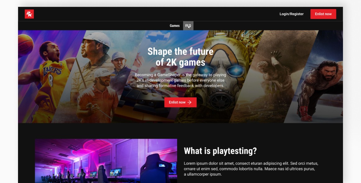
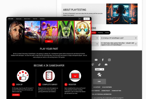
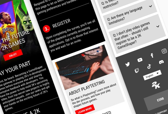
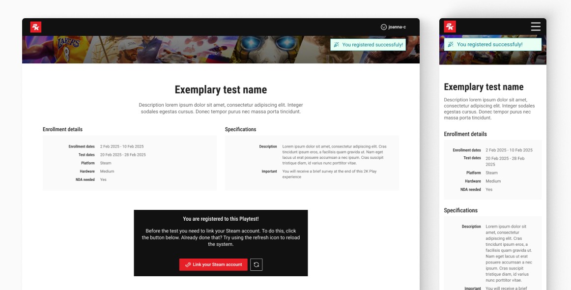
My task was to transform the existing user flow and landing page so that it would work within the CMS, be easy to use, comply with usability principles, but at the same time be aesthetically pleasing and inviting. Previously, Gameshapers systems (that's the name of the platform) were custom coded, but still looked uninviting and rather sad (as you can see in the screenshots on the right).
Problem definition
Stakeholder interviews
Before starting the design work, I had several conversations
with the client about how the platform had worked so far. What the new needs were, what had worked and what needed
to be included in the new flow. The Gameshapers platform allows people to sign up for playtests, manage their playtests, but
also allows administrators to manage data and introduce new playtests. The client had worked with the platform for many years and knew it inside out, so the discussions were very relevant
and a great source of knowledge.
Cooperation with developers
The next step was to talk to the developers, who have been working on the system for a long time and know all the problems and possibilities. I had several of these conversations where
we went through the steps a user would have to go through,
both from the player side and the admin side. This gave me the opportunity to look at the limitations and problems that arise not from a poorly designed path, but from technical barriers. At every stage of my design work, I communicated with the developers
o make sure that the proposed options were feasible.

Solution design
After talking to the client and developers, I already had a better understanding of the system I would be dealing with. The next step was to go through all the registration steps and all the sections of the landing page myself. I wrote down all the pain points I noticed. I compared the content on the LP with the beacon components I had already created - to make a preliminary
list of which of these components could be reused on this new page. I wanted as many sections as possible to be created from existing components. In this way I minimised the need for further developer work and speeded up the process of transferring
the portal to the CMS.
Execution
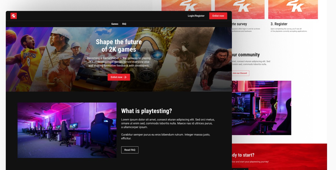
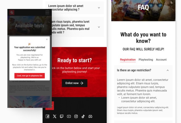
Finally, it was possible to redesign the landing page so that the entire page was built from existing components in the library.
I redesigned the existing sections so that the page tells a story and is more comprehensible to the viewer - so that the user knows at a glance what playtests are, what they need to do
to sign up for them, who can take part, etc.
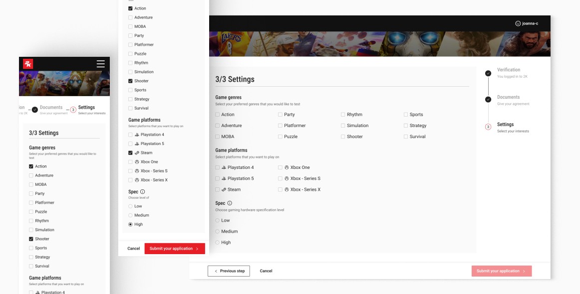
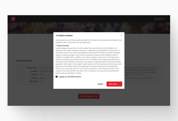
I have made the registration process much simpler and worked
on the messages. They are now more concise, but better explain what is happening at each step. Previously, the user would see
a kind of onboarding that would abruptly stop the process and make the user forget which step they were in. Instead, I opted
for short descriptions that were immediately visible, so the user would not get lost.
©2025 Joanna Chabowska