Amway
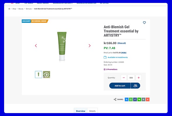
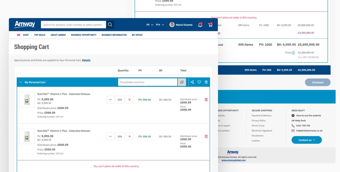
Long-term project for a global e-commerce client that was changing its business model to allow purchases by non-registered users. This required changes to the interface, taking into account not only the new features, but also the implementation of a new design system across stores in Europe and Africa, with the aim of not discouraging
a large user base.
This also allowed the team to audit the existing solutions and suggest ones that were more up-to-date and user-friendly.
role
Product Designer
market
Europe & Africa
Participation
1,5 years
industry
E-commerce
scope of work
UX Design
UI Design
User testing
Data Visualization
Audit
Requirements elicitation
Wireframing
Scoping
Insights gathering
Competitor analysis
User flow
Design system
tools
Figma
Mural
Maze
Jira
Hotjar
Confluence
Google Meet
Process
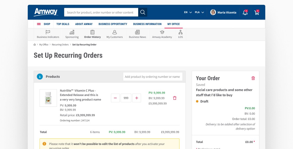
The team working on the project was international. There were business analysts and developers in Russia, mobile developers in India, product owners and the product design team in Poland, and the managing director in the Netherlands. This collaboration, while challenging, was very fruitful. Agile helped to coordinate such a large team from so many places around the world.
We worked in two-week sprints, within a previously agreed scope, and we regularly presented the effects of our work to each other.
All colleagues worked closely together and everyone was helpful with any questions. This attitude allowed us to implement subsequent ideas quickly and easily.
As a PD team, we had the opportunity to regularly test the solutions we proposed during user research. We prepared moderated research, the report of which was later used
as a basis for implementing improvements in the designed process.

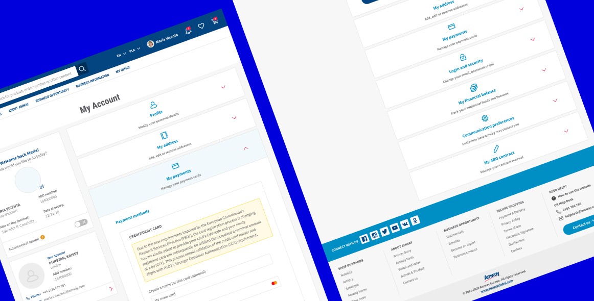
Design systems
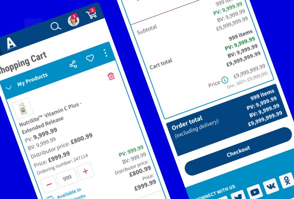
A very important element of my work was organising and structuring the system design. When the collaboration started, there were many design systems: each different for a different market. One of my tasks was to make them consistent so that they would be as easy to implement as possible, while at the same time allowing each market to retain its own style.
This was achieved and there are now two main design systems: one for the US market and one for the rest of the world, with
the biggest differences being in colours and fonts, but we have managed to keep a lot of similarity within the brand.

Reports
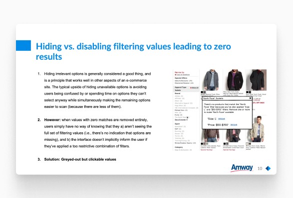
As the sales system was very complex, we had to ensure
its quality and compliance with best practices and usability principles. We regularly researched the market and the competition to see which methods worked and which caused problems for users.
To properly document our design decisions, each member of
the team produced reports containing an audit of a part of the system, good practices and information on what needed to be improved. Reports were also produced after each usability test.
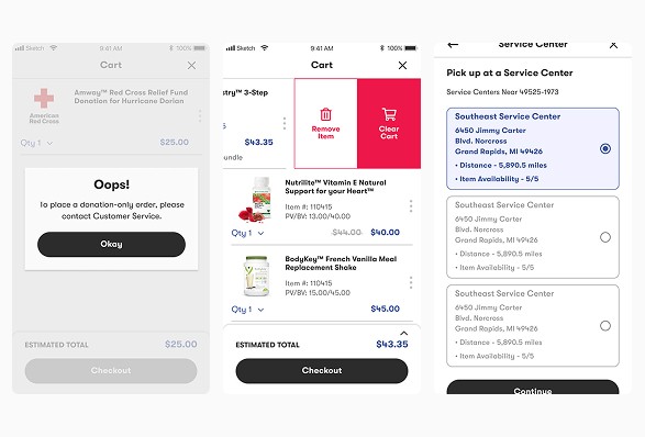
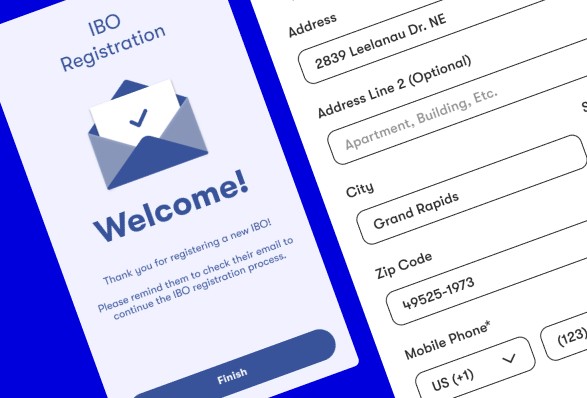
Mobile app
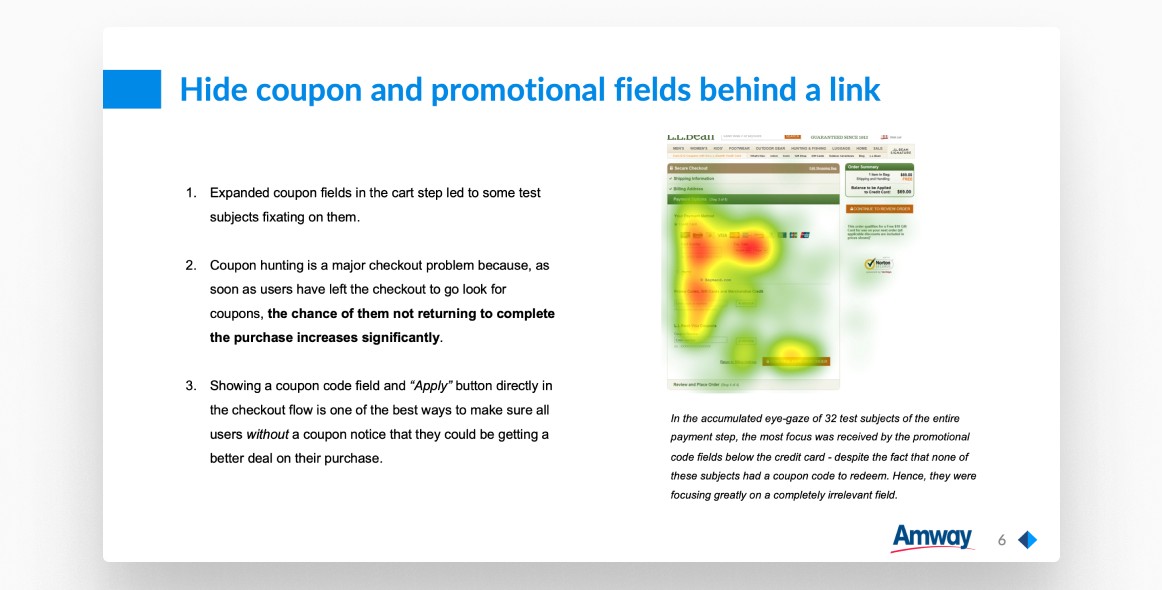
In addition to the desktop e-commerce website, Amway also developed its mobile application. A team in the US was responsible for creating it, but over time the Polish team began to support it. We adapted the processes to European users
and to European standards and legal requirements.
My overall role here
analysing competitors and market trends to identify opportunities and challenges,
working closely with product owners and business analysts to gather insights and requirements,
creating rough sketches, wireframes, or prototypes
to visualise concepts and iterate on them,
developing high-fidelity prototypes using Figma and creating detailed design specifications,
working closely with developers to ensure the feasibility and proper implementation of the design,
monitoring the product after launch to gather feedback and identify areas for improvement.
maintaining open communication with cross-functional team to gather feedback and make necessary adjustments,
preparing design assets, specifications, and documentation,
conducting usability testing with actual users to validate design decisions and identify any potential issues,
continuing to refine and enhance the design through multiple iterations,
Exemplary design
challenge

Discovery
Background
Although the company was changing to allow direct sales
to users not registered in the system, it still relied heavily on
a system where sellers reached customers and orders went through them. Each of these sellers needed a kind of online business card to introduce themselves to potential customers.
Challenge
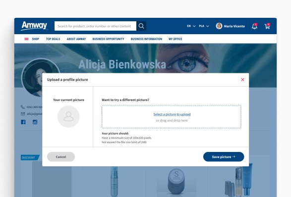
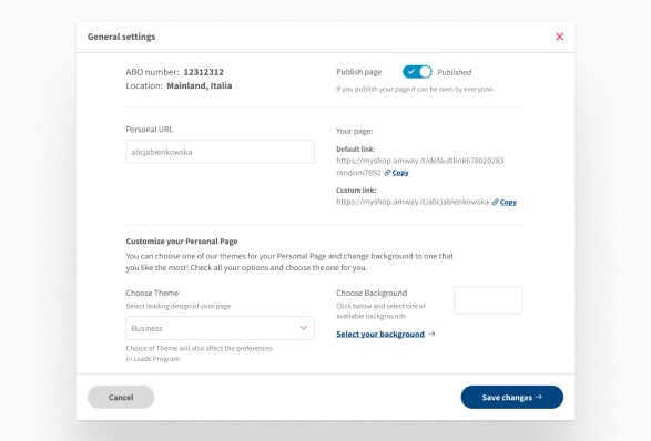
The website had to be fully editable and drag and drop. In this way, it could be personalised as much as possible and reflect the character of the person publishing it.
Goals
We needed a design that would briefly introduce the seller, but also allow them to present available products, offers, social media, recommendations, etc.
Problem definition
Workshops
It all started with a short workshop, during which we managed
to list the functions necessary for such a website and the expectations regarding their personalisation.
Scoping
Discussions with business analysts allowed us to divide such
a large task into smaller ones and define priorities for each
of them, as well as technological restrictions and possibilities.
Solution design
Challenges
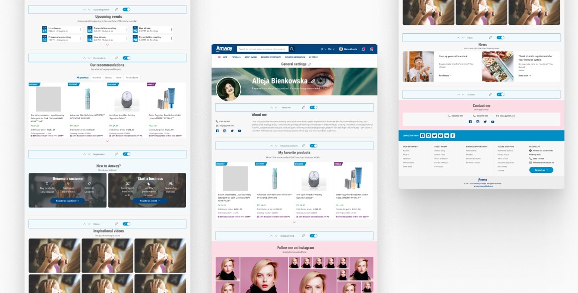
Every option needed to be editable. Editing had to be easy because the site would be created by people who were not tech-savvy. The editing options also needed to be in a visible place and not interfere with each other. Each section also needed
to be drag-and-drop moveable, but with arrows so that all
users understood that the sections could be moved anywhere.
Execution
The idea
Each section is designed according to the brand guidelines
and the available design system. Editing options are available
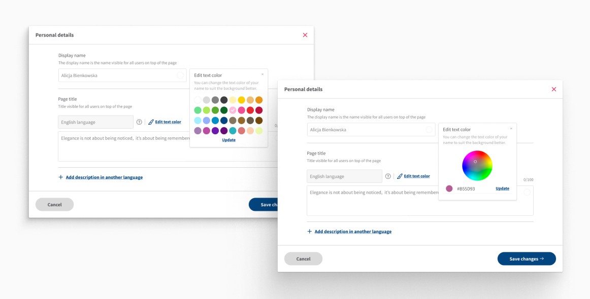
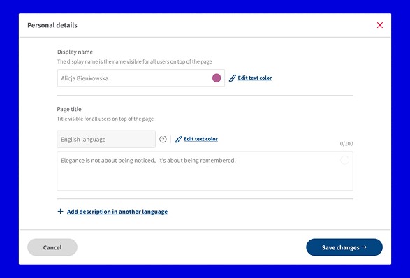
in separate modal windows - so each element can be edited individually, without hindrance and with as few errors as possible. The user can also toggle the editing option on and off with the icon at the top. I also decided to add bars to each separate section, where it is possible to change the location with arrows, open edit window and turn the section on/off.
Feedback
The idea was tested in conversations with users. I prepared
a clickable prototype that best reflected the system's operation. Another person from the team tested it with volunteers and collected feedback. The design went through several iterations until it gained the approval of the client and users, and we were sure that it met all the guidelines and needs.


©2025 Joanna Chabowska