Auto
The US start-up is working on a model automation platform that
will allow users to deliver vertical slices from the event model directly to production using AI. Most modelers rely on diagramming tools that are not really fit for purpose. Auto helps them with advanced features that go far beyond static diagrams.
The product is also, so to speak, a combination of Miro, AI and an IDE platform. It offers great possibilities for teams working on their own product - it allows them to write out user flows in diagrams, to include specifications for developers, to include screenshots from Figma,
to link them to a specific task in Jira, etc. All of the team's work can take place in one place, without having to switch between softwares.
role
Product Designer
market
United States
Participation
1 year
industry
AI & Event modeling
scope of work
UX Design
UI Design
Prototyping
Data Visualization
Design system
Insights gathering
Scoping
AI
Requirements elicitation
tools
Figma
Miro
Linear
Slack
Notion
Zoom

Process
I joined the project while it was in progress. At the time, however, only the backend of the product existed. Design was practically non-existent, apart from a few interface elements that were prepared using the off-the-shelf Material Design library. I was the first designer in the team and my job was to translate the ideas and existing processes in the backend into meaningful screens.
The first thing I had to deal with was the specific audience. Event Modelling people are a niche group, but very open to ideas and
willing to talk. We regularly showed them the product, organised demos and thus gained direct feedback and information about
the needs of future users.
The team working on the product was small but enthusiastic.
They welcomed me with open arms and were open to suggestions and UX improvements. Initially we worked in two-week sprints,
but a start-up has its own rules and many times we had to change to a more waterfall approach and ad-hoc design.
Design system
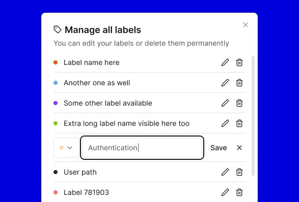
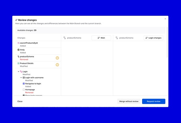
The design system for Auto is quite a specific tool because, in addition to the typical components such as buttons, inputs and toasts, there are a great many components in the system that are typical only for this product. As well as those related to event modelling.
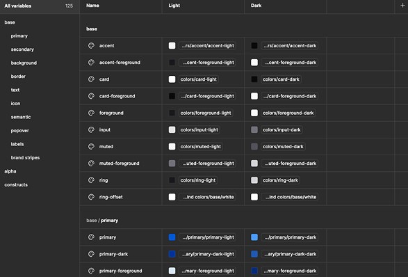
As the only designer in the team, I was tasked with setting up such a system from scratch (we abandoned Material UI shortly after I joined), with tokens that made it easy for developers to implement. I also had to make sure that the components were easy to use - so that other people in the team could use them quickly and confidently.


Artificial Intelligence
The product relies heavily on AI. Its two main uses are to convert diagrams into production-ready code, and to use a chatbot
to create user paths and documentation.
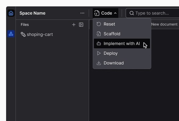
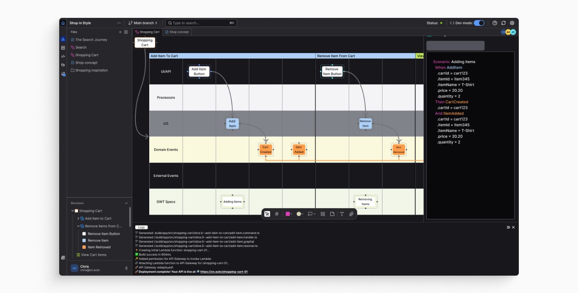
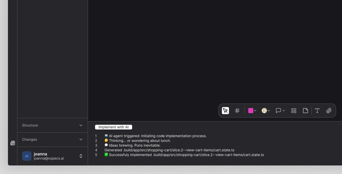
Diagrams can be created based on Event Modeling - we can have slices containing information about what the user was doing at any given time, and what was happening simultaneously in the system and being displayed on the interface. Once such
a slice has been created, the 'Implement with AI' option can be selected from the menu and in a short time, code will begin to be generated. This code can be monitored and edited at any stage.

Chatbot can be used to create the diagrams mentioned above.
It can also be used to generate documentation. We can also ask it to create a copy of an existing application, and it will generate user and system paths for us from the application we have just selected.
We can write to the chatbot, but we can also talk to it. At each stage, it informs the user of what is happening and what the options and next steps are.

My overall role here
taking care of the UX maturity of the product,
creating the documentation and design of the system from scratch,
maintenance of the system design, ongoing component updates, management of the design changelog,
generating ideas for potential design solutions, visualising concepts and iterating on them,
working closely with the whole team to ensure the feasibility and proper implementation of the design,
turning feedback into new user flows,
monitoring the competition, looking for the best solutions that work for others,
preparing marketing materials, taking care of brand consistency, helping with projects spreading awareness of the product,
identifying edge cases and implementing solutions that would minimise risks,
continuing to refine and enhance the design through multiple iterations,
monitoring the product after launch to gather feedback and identify areas for improvement.
Exemplary design
challenge
Discovery
Background
As the Auto began to take shape, we started to conduct demos with potential users. During such discussions, a problem came to light that required the team's urgent attention. Well, the product seemed to be too difficult to use and was aimed at an advanced user. It turned out that we had focused too much attention on features that would excite developers, while neglecting the audience that had nothing to do with coding.
Challenge
We wanted our product to be used by cross-functional teams, so user feedback like this could not be ignored. The Auto was meant to be a tool that would make each person's job easier, to ultimately make the team's job easier. We wanted the product to unify a lot of software into one, rather than create another source of knowledge that only a few could access.
Goals
Simplify the user experience for people with no development experience. Make it easy for the whole project team to use the application.
Problem definition
Demos for users
I had the opportunity to watch demos conducted by our CEO with people intrigued by Auto. I wrote down the key findings that were repeated between users. And then I verified how other IDE platforms deal with this problem and whether they are as complicated to use for a non-technical person.
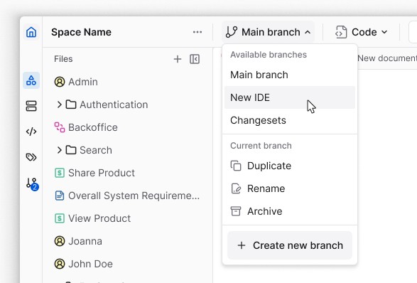
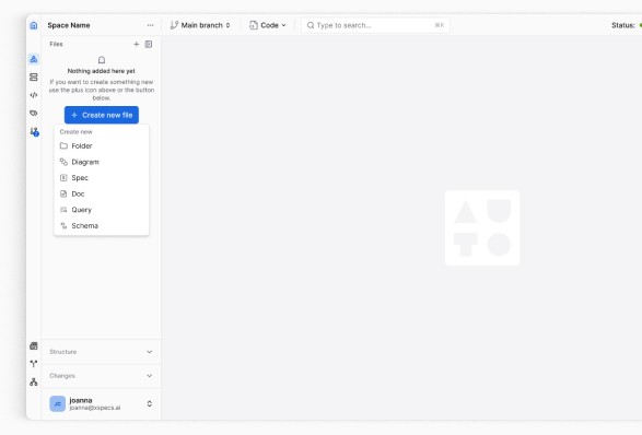
A recurring opinion between users was that there are too many options visible at a glance.
Scoping
We have looked again at the options available in the app. We divided them into those that should be available to everyone
and those that are strictly for technical teams. In doing so, we specified our user personas and decided to limit the number
of tools in the default view.
This is how the Easy Mode and Dev Mode came about.
Solution design
Challenges
The new approach required the app to be split into two parts:
for regular users and those with extensive technical knowledge. Some of the available options were to activate only after identifying which type of user we were dealing with. And at the same time, launching such a customised view should be simple and intuitive. It should be an option available at the top of the
interface so that the user can easily click through the options available in the application. After all, it was important that personas could change between them and a regular user
might want to see a more detailed screen and vice versa.
Execution
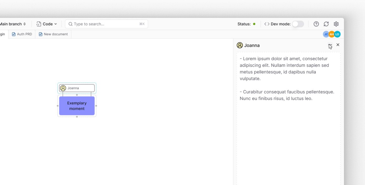
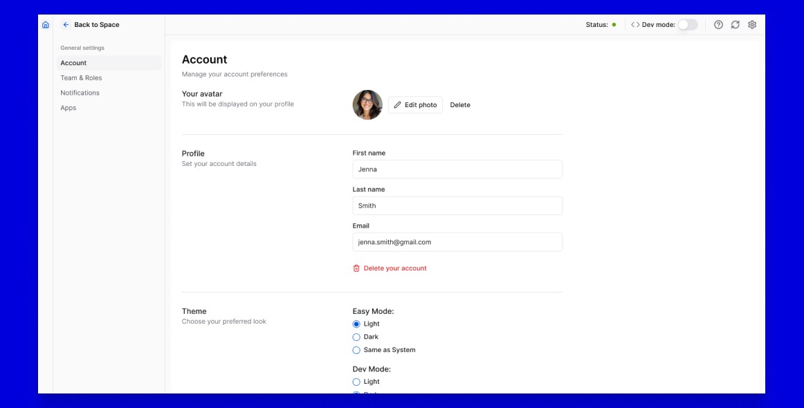
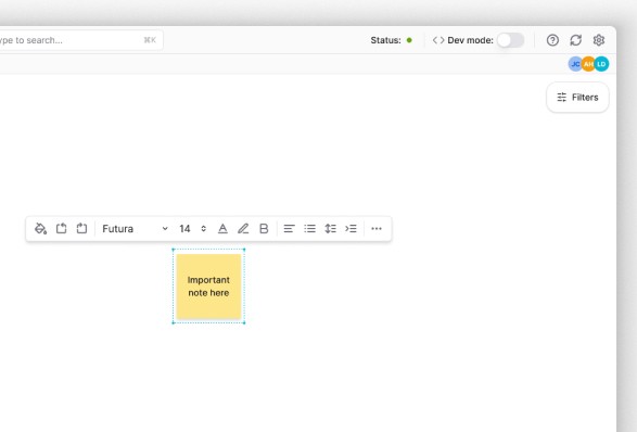
As the option to change the view had to be at hand, we decided to place it in the top menu. It appeared there in the form of
a switch with a label. In this way, the user can adjust the desired view with a single click.
Subsequent discussions with users showed that the new option and its placement proved to be a good initiative.
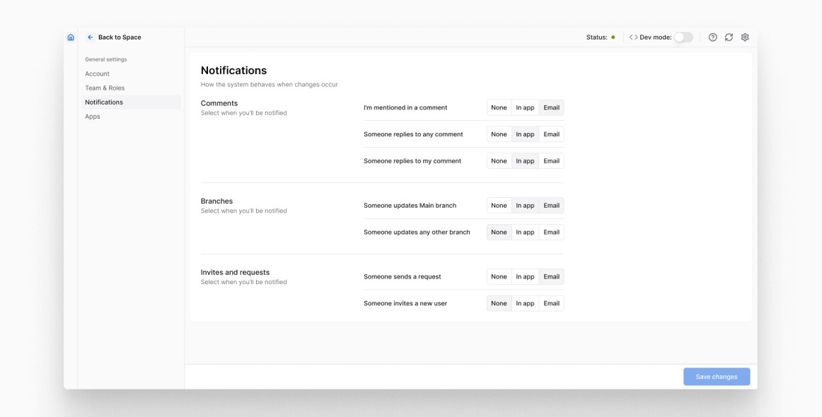
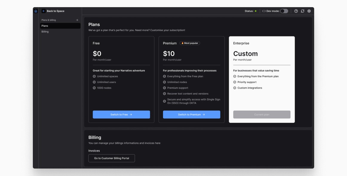
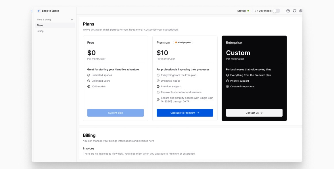
Another important change was the adaptation of the theme under the selected mode. Easy Mode was designed for non-technical people and is displayed in Light theme by default. Dev Mode for developers by default in Dark theme.
This can, of course, be adjusted in the user settings if desired.
©2025 Joanna Chabowska