Under NDA
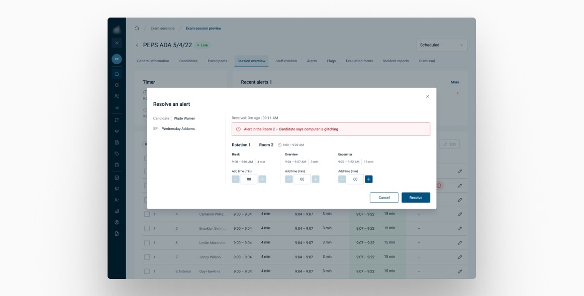
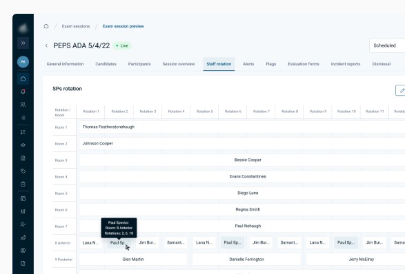
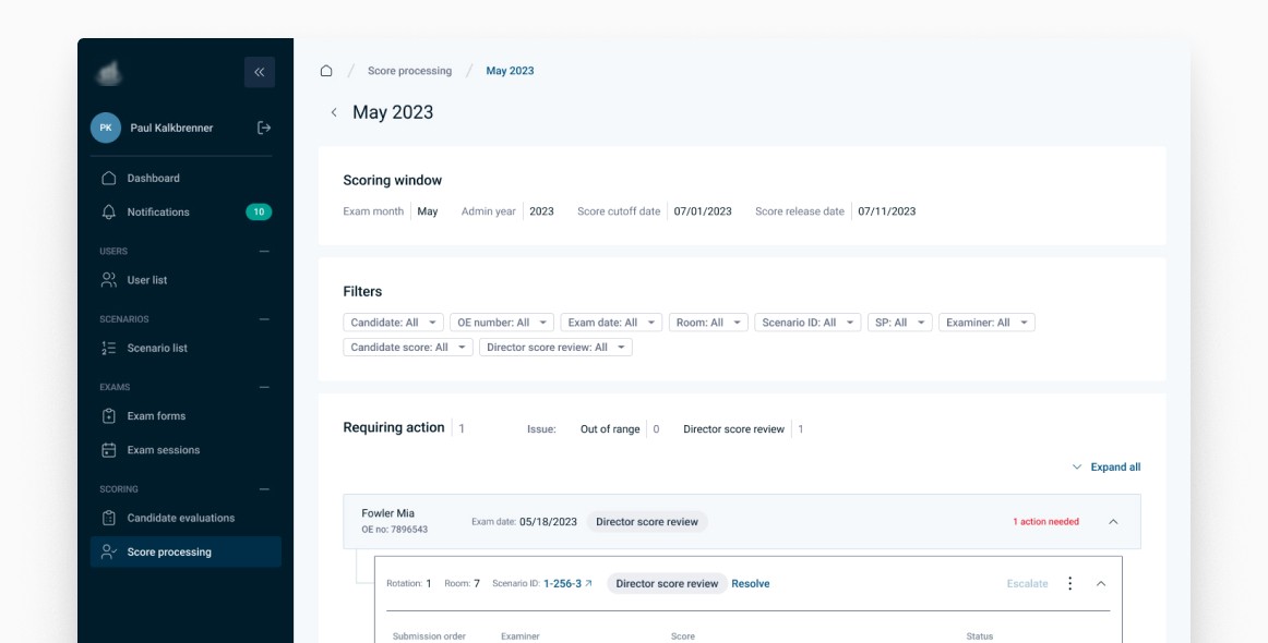
An examination platform that enables the client to manage
and execute specialist evaluation processes within one system. Designed for multiple user personas with diverse needs,
including administrators, candidates, and examiners.
The platform offers a tailored interface for candidates
to navigate through examinations effortlessly, provides
administrators with robust management tools, and equips
examiners with a streamlined evaluation process.
role
Product Designer
market
United States
Participation
1 year
industry
Healthcare
scope of work
UX Design
UI Design
Prototyping
User testing
Data Visualization
Audit
Insights gathering
Scoping
User research
Design system
tools
Figma
Mural
Maze
Jira
Hotjar
Confluence
Google Meet
Process
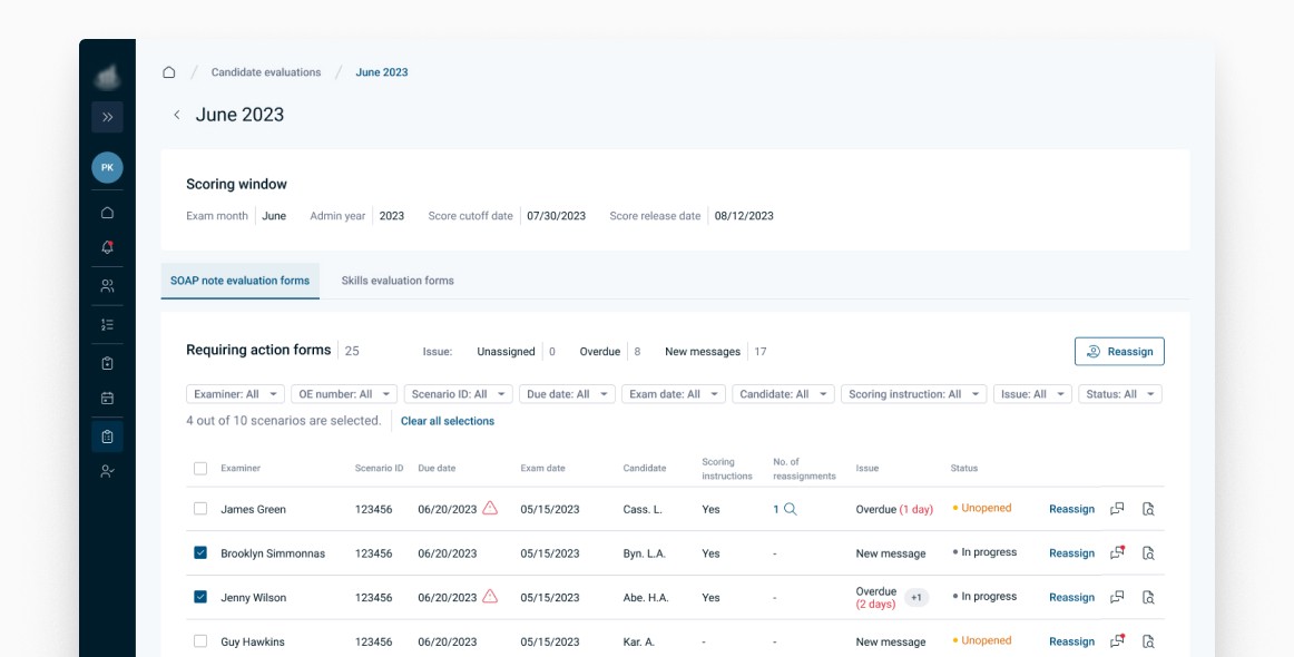
I joined the project after it had been running for just over a year. So it wasn't an easy onboarding for me, as there were already multiple documentation files, multiple Figma screens and lots
of Confluence pages to read. But the team and client were very welcoming and helpful, which really speeded up my onboarding process.
The project team worked in a 2-week sprint system coordinated by our Scrum Master. The product design team consisted of 3
designers working closely together to come up with the best possible solutions.
We had a Product Owner on our side who was in constant contact with the client and helped us gather the requirements. As a PD team, we turned these requirements into actual user flows and then into wireframes and high-fidelity screens. Once a week
we had a meeting with the developers to confirm the solutions and then they were shown to the client during the weekly review.
User testing
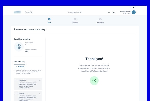
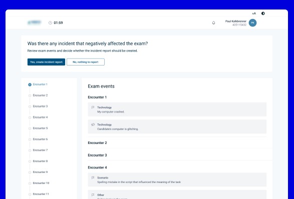
Every major part of our design work was tested with users.
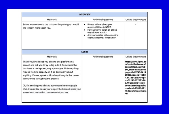
The product design team was responsible for writing a research scenario, preparing a working prototype, selecting the type
of users and communicating this with the client, running
the tests, taking notes during the tests, writing the report afterwards and presenting the results during the call.
Most of the time these were moderated tests, but for some
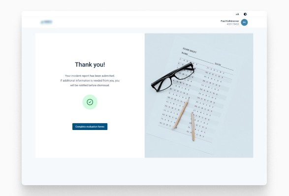
small parts of the system we also used Maze to quickly check what users think and expect. In such cases, only a prototype
was prepared and a proper link was sent to the selected users, along with appropriate instructions.

My overall role here
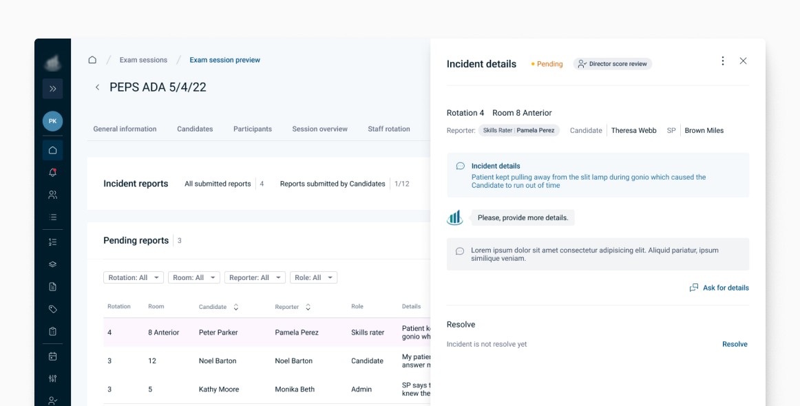
analysing competitors and market trends to identify opportunities and challenges,
working closely with product managers, stakeholders, and other team members to gather insights and requirements,
generating ideas for potential design solutions, visualising concepts and iterating on them,
developing high-fidelity prototypes using Figma and creating detailed design specifications,
working closely with developers to ensure the feasibility and proper implementation of the design,
maintaining open communication with cross-functional team to gather feedback and make necessary adjustments,
preparing design assets, specifications, and documentation,
conducting usability testing with actual users to validate design decisions and identify any potential issues,
continuing to refine and enhance the design through multiple iterations,
monitoring the product after launch to gather feedback and identify areas for improvement.
Exemplary design
challenge
Discovery
Background
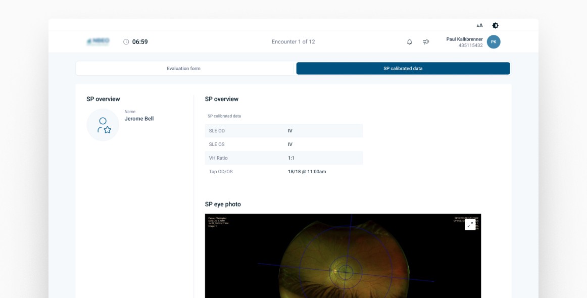
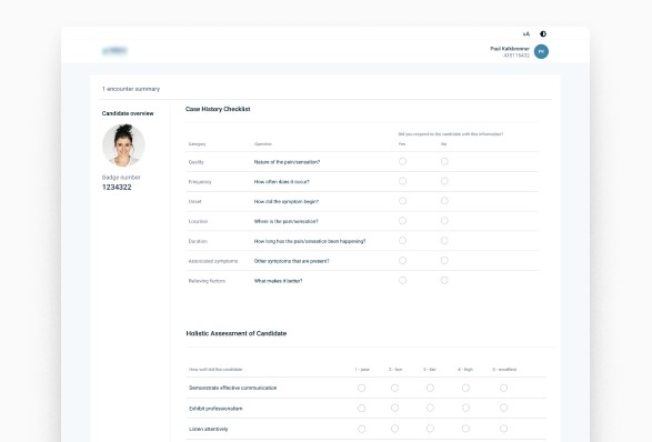
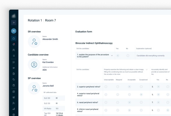
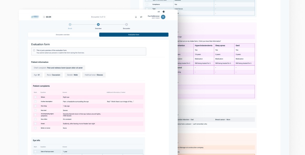
The system contained a lot of data and information, which was quite difficult to translate into a design that could be read and understood. One of the problems I encountered was the student assessment form. It appeared in the system while the optometry students were being assessed and required a quick response - the assessor had to mark answers on the fly while the assessment was taking place. It turned out that the sections in question were not visually distinctive enough and assessors were getting lost when using the form.
Challenge
The whole system was designed to work with light shades
of blue, leaving little flexibility when it came to using other colours.
Goals
Readability was key, as was the ability for the assessor to quickly read the data on the form, so that the assessment of the student was efficient and seamless. The user's focus should be
on examining the student, rather than looking for a particular place in the table to be filled in at a particular time.
Problem definition
Stakeholder interviews
I was in constant contact with the Associate Director on the
client side, who knew the product inside out and also had the opportunity to observe live the exams for which the form
in question was being used. She gathered user feedback and
I was able to implement the next iteration of the form design based on this.
Scoping
Before redesigning the form, it was important to redesign
the content. Previously, the questions were all in one place,
on one continuous line. They needed to be divided into smaller categories to make it easier for the eye to find the place
of interest. The categories were also to be marked with appropriate colours to make them even easier to read.
Execution
Remodeling design system
Due to new requirements, I was given the green light to remodel the colours in the design system and add new ones that could serve as a complement to the blue shades that have been mainly used so far.
Usability test
A new form was added to the subsequent user survey scenario
to see how users would interact with the new design. Users found the information on the new form much quicker and appreciated its clarity and readability. The time taken to understand what was happening on the screen was significantly reduced, allowing examiners to focus on assessing students without distractions.


©2025 Joanna Chabowska