Traece
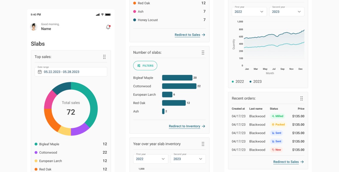
Mobile app for managing inventory, running operations and even selling products. It is a unique product tailored for millers and sawyers’ needs. It allows users to track material from original source (like fallen trees, salvaged wood, and deconstructed building material), through milling and drying and on to the final product.
The app was designed with difficult outdoor working conditions in mind - that's why it has a well-thought-out scanning system. Thanks to the app users have access to multiple tools and workflows that help them control quality and increase productivity. They get full control of the production process and can do it with ease.
role
Product Designer
market
United States
Participation
8 months
industry
Inventory Management
scope of work
UI Design
UX Design
Workshop facilitation
User flow
Data Visualization
Requirements elicitation
Wireframing
Insights gathering
Design system
tools
Figma
Mural
Slack
Google Meet
Process
The design process began with workshops with the client
to understand their needs. We worked as a team of specialists
to get as many answers as possible. The workshops lasted two days and were conducted online, which was no obstacle thanks
to Mural. Through many hours of discussion and design thinking exercises, we were able to clearly define the goals and objectives of the design project.
Then the other product designer and I had a brainstorming session to generate ideas for possible design solutions. This was
used to create rough sketches, wireframes and prototypes
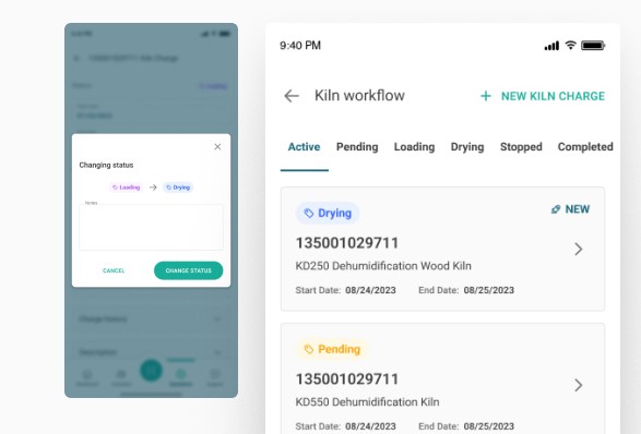
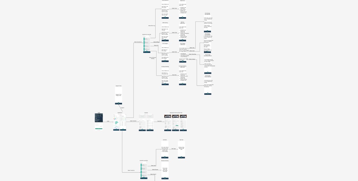
to visualise and iterate concepts. The user flow here was quite complicated, so there was a need for frequent calls with the client to elaborate on it. The UX and UI work was done in parallel - while the first wireframes were being created, the design system and new components were also appearing in Figma.
The whole project was based on Flutter technology and I was
in constant contact with the developers to get the best results.
Target users
We had 3 target users:
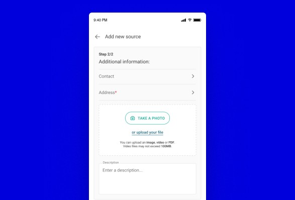
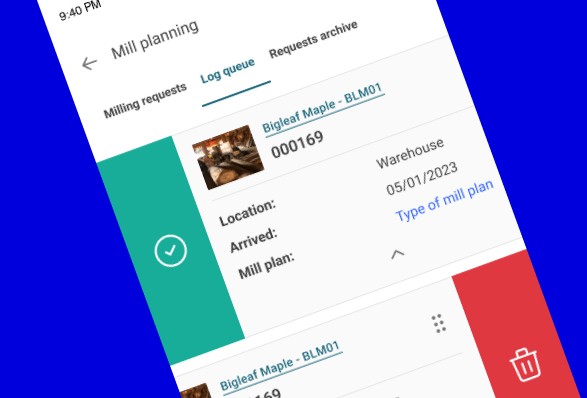
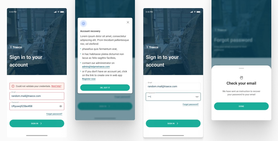
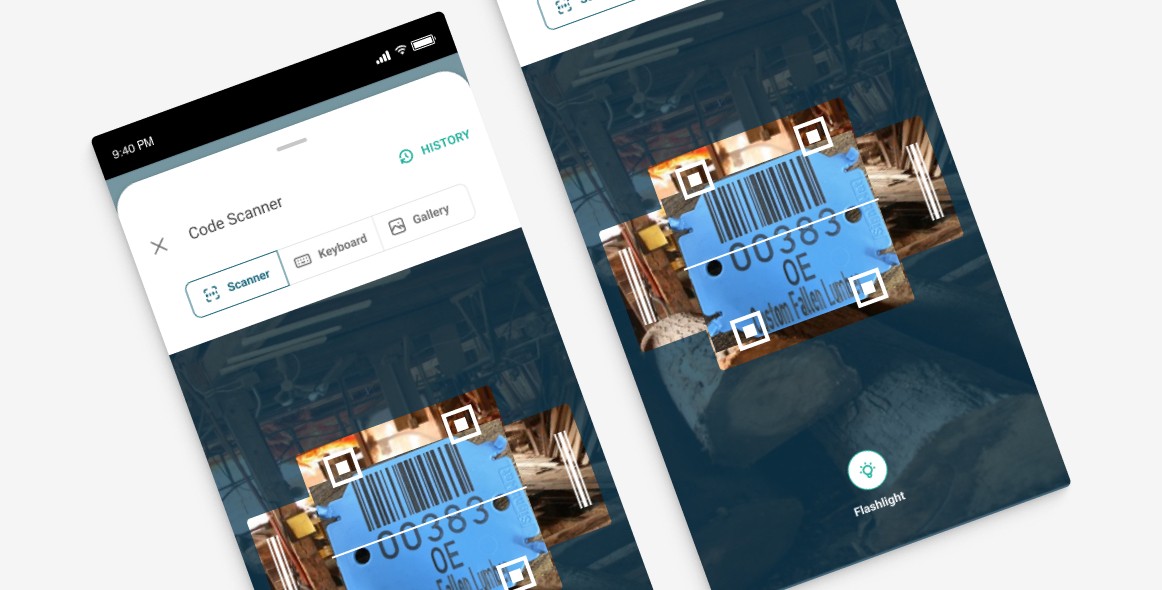
sawmill workers scanning products during production and in varying weather conditions - they needed solutions that were easy to click on and use on e.g. rainy days (that's why there's a flashlight option),
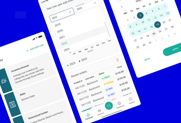
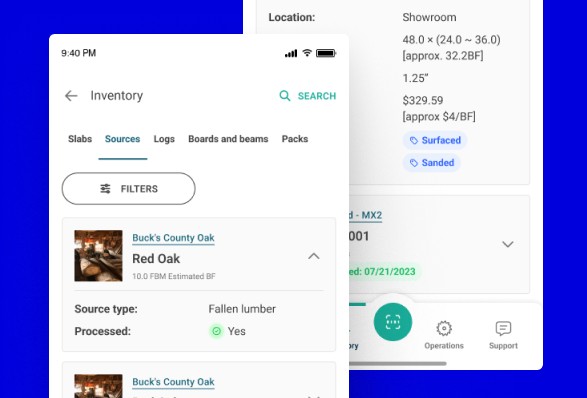
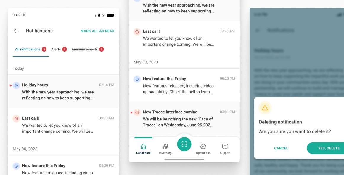
warehouse workers who manage storage, packing, shipping, etc. - they needed a process that would be fast and immediately available within the app (that's why the scan button is the most prominent one in the menu),
sellers in stores who update product quantities - they needed
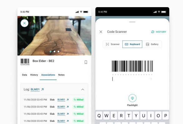
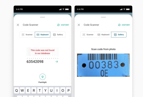
a reliable connection to inventory (hence the three different ways of entering scanned data).
My overall role here
research and discovery phase,
analysing competitors and market trends to identify opportunities and challenges,
working closely with product managers, stakeholders, and other team members to gather insights and requirements,
generating ideas for potential design solutions, visualising concepts and iterating on them,
developing high-fidelity prototypes using Figma and creating detailed design specifications,
working closely with developers to ensure the feasibility and proper implementation of the design,
maintaining open communication with cross-functional team to gather feedback and make necessary adjustments,
preparing design assets, specifications, and documentation.
The app was launched on both the AppStore and Google Play,
and then tested with users. It got a lot of attention in the industry and the feedback from users was also positive. Unfortunately,
I didn't get a chance to iterate after the launch because the budget was tight.
The whole team working on this contained 2 Product Designers,
1 Project Manager, 2 Flutter Developers, 1 Quality Assurance. There were 2 people on the client’s side + a few developers working on a desktop version for this project simultaneously.
Exemplary design
challenge
Discovery
Background
Among other things, the app was supposed to speed up the work of the sawmill workers and make it easier for them to use the technology in difficult weather conditions. Therefore, it was very important to add a scan option that would be easily accessible and quick to open.
Challenge
The biggest challenge was the potential weather conditions - the users were working outdoors and needed to use the application there. What's more, they were working with gloves and heavy equipment, so every option they needed had to be well thought out in terms of size, positioning and ease of use.
Goals
Creating a timber scanning path to a database that will make work easier and faster.
Problem definition
Workshops
The workshops took place before we started working on the application. We had two days as a team to gather as much information as possible. We worked with the Design Thinking method. I led them together with the other Product Designer. Before we started, we received a lot of materials and a detailed brief from the client, so it was easier to understand the needs
before the meeting.
During these two days, we built user personas, listed the features necessary in the application, created two sample user flows and developed the look and feel of the project.
Solution design
Market analysis
Before I started working on a specific solution, I checked
out several dozen other apps that use the scanning option.
I compared their functions and capabilities and created a table with screenshots and a description of each example. On this basis, I was able to verify which functionalities would also
be useful in our flow.
Live verification
The next step was to see how the features work in real life, not just in theory. I decided to try out the apps of several clothing stores, so I went to the shopping centre and launched the apps
of different brands one after the other to try out their scanning function. I wrote down each step of the scanner and then uploaded it to a previously prepared market analysis board.
Execution
The client sent us sample tags to be scanned with our app. This allowed us to check the scanning area, the contrast and whether it is comfortable to hold.
I prepared a path for scanning such tags, in which the scanner button is placed in middle of the bottom menu. The button is larger than the rest of the options, it is in the primary version, so
it is easy to see and quick to click.
All the functions that appear during scanning are large, making
them easier to click on when wearing gloves. The scanner itself takes up the entire screen, making it easier to read. In addition,
to make it easier to work in difficult conditions, such as when there is no sunlight, a flashlight function has been added, which can be activated with a single click and is always visible on the main screen.
Thanks to the fact that we had real tags used in the sawmill for testing, it was possible to check how the scanner actually dealt with them once the workflow had been developed.

©2025 Joanna Chabowska